
Logo Design Best Practices
With Vector Graphics
Create professional logos that work at any size, on any platform. Master the essentials of vector logo design.
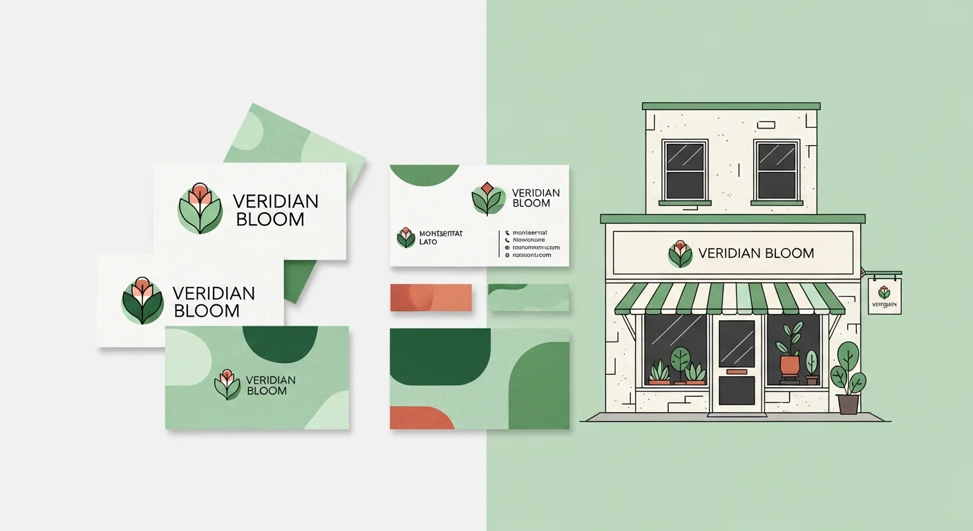
A logo is more than just a pretty picture. It's the face of a brand, appearing on everything from tiny favicons to massive billboards. Professional logos must be vector-based to maintain quality across all applications.
Whether you're designing a new logo or vectorizing an existing one, these best practices will help you create work that stands the test of time.
Core Principles of Logo Design
Simplicity
The best logos are simple and memorable. Think Nike's swoosh or Apple's apple. Simple logos are easier to recognize and work better at small sizes.
Scalability
A logo must look good at 16px (favicon) and 16 feet (billboard). Vector graphics make this possible without quality loss.
Memorability
A great logo is instantly recognizable, even from a brief glance. Distinctive shapes and colors help achieve this.
Versatility
Logos need to work in color, black & white, reversed on dark backgrounds, and in various aspect ratios.
Logo Design Do's and Don'ts
Do's
- Design in vector from the start
- Test at multiple sizes (16px to 1000px+)
- Create black & white versions
- Use a limited color palette (2-3 colors)
- Keep paths clean and optimized
- Convert text to outlines for final files
Don'ts
- Design logos in Photoshop (raster)
- Use too many colors or gradients
- Include tiny details that disappear at small sizes
- Rely on effects (shadows, glows) for impact
- Use raster images in logo files
- Follow trends that will date quickly
Essential Logo File Deliverables
A complete logo package should include these file formats:
.AI / .EPS
Master vector files for editing and print production
.SVG
Web-ready vector format for websites and apps
Universal format for sharing and printing
.PNG
High-res raster exports at various sizes (transparent)
.ICO / .ICNS
Favicon and app icon formats
Creating Logo Variations
A professional logo system includes multiple variations for different use cases:
Primary Logo
Full logo with icon and wordmark
Icon Only
Symbol/icon without text (for favicons, app icons)
Wordmark Only
Text/company name without the icon
Horizontal Layout
Icon and wordmark side by side
Stacked/Vertical
Icon above wordmark
Reversed/White
For use on dark backgrounds
Pro Tips for Vector Logos
- Use a grid: Design on a grid for balanced proportions and easier scaling.
- Mind the negative space: The space around and within the logo is just as important as the shapes.
- Test on real applications: Mock up the logo on business cards, websites, and products.
- Squint test: If you can still recognize the logo while squinting, it's simple enough.
Related Articles
Convert Your Logo to Vector
Have a logo that's only in PNG or JPG? Convert it to a clean, scalable SVG vector with VectoSolve.
Vectorize Your Logo