Year in Review Graphics: Templates and Tips for 2026 Retrospectives
Create stunning year-in-review graphics for your brand. Templates, data visualization tips, and design strategies for impactful annual retrospectives.
Graphics & Design Experts
Our team of experienced designers and developers specializes in vector graphics, image conversion, and digital design optimization. With over 10 years of combined experience in graphic design and web development.
Why Year-in-Review Graphics Matter More Than You Think
Every December, organizations face the same challenge: how do you distill twelve months of effort, milestones, and growth into something stakeholders actually want to read? The answer is visual storytelling. A well-designed year-in-review transforms raw data into a narrative that builds trust with investors, energizes employees, and signals credibility to prospects.
Visual annual retrospectives receive three to five times more engagement than text-only reports. When your board members, customers, and social followers can see the trajectory — not just read about it — they internalize the story.
Key Takeaways
- Year-in-review graphics drive 3-5x more engagement than text-only retrospectives
- Four essential formats: social carousel, infographic, animated video, and PDF report
- Data visualization selection depends on the story you are telling, not the data you have
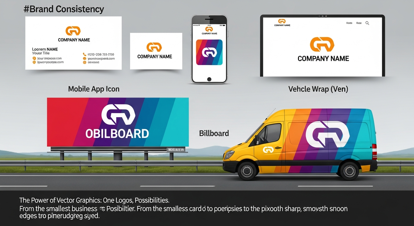
- Brand consistency across all retrospective assets reinforces organizational identity
- Vector-based graphics ensure your retrospective looks sharp everywhere — convert raster assets with VectoSolve
Template Ideas for Every Year-in-Review Format
The most effective retrospective campaigns deploy multiple formats from a single content backbone. Here are the four templates every communications team should produce.
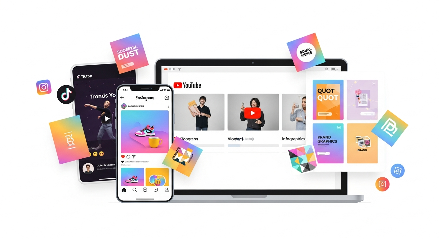
1. Social Media Carousel
Carousels are the highest-engagement format on Instagram and LinkedIn. Structure yours in 7-10 slides:
Export text-heavy slides as SVG to guarantee sharpness on every screen density.
2. Long-Form Infographic
Infographics remain the go-to format for stakeholder presentations. Structure the vertical layout with a header block (year, brand, one-sentence theme), a key statistics row with three to four hero numbers, a visual timeline of quarterly milestones, a data visualization section, a highlights grid, a pull quote, and a forward-looking CTA. Export as SVG for web and high-resolution PNG for print.
3. Animated Video Summary
Short-form video (30-90 seconds) is essential for social distribution. Build animations from vector assets: counters that tick up to hero metrics, timelines that draw themselves, chart bars that grow with easing. VectoSolve AI Animate lets you take static vector graphics and generate timed animations without writing code — ideal for teams that need motion graphics but lack After Effects expertise.
4. PDF Annual Report
For board presentations and investor updates, a designed PDF remains the standard. Use vector graphics for all charts and logos so they render at any zoom level. Embed fonts, target 150-300 DPI for photography, and keep file size under 10MB. Browse layout starting points in the VectoSolve Templates library.
Choosing the Right Data Visualization
The most common mistake in year-in-review graphics is choosing a chart type based on what looks impressive rather than what communicates clearly.
| Data Story | Best Chart Type | When to Use | Example | |---|---|---|---| | Growth over time | Line or area chart | Showing a trend across months or quarters | Revenue growth Q1-Q4 | | Year-over-year comparison | Grouped bar chart | Comparing two periods side by side | 2024 vs 2025 signups | | Part of a whole | Donut chart | Showing composition (max 5 segments) | Revenue by product line | | Progress toward a goal | Progress bar or gauge | Showing completion percentage | Annual OKR achievement | | Ranking | Horizontal bar chart | Ordering items by magnitude | Top 10 customers by revenue | | Geographic distribution | Choropleth map | Showing regional performance | Sales by country | | Correlation | Scatter plot | Relationship between two variables | Ad spend vs conversion rate |
Timeline and Milestone Design Patterns
Timelines give structure to the narrative and help audiences orient themselves in the story.
Horizontal timeline — Best for presentations and wide-format infographics. Place months along the x-axis with milestone markers alternating above and below the line.
Vertical timeline — Best for scrollable web pages and mobile. Each milestone gets its own row with a date badge, icon, headline, and one-sentence description.
Milestone cards — Best for social carousels. Each milestone is a self-contained card with a date, metric, and brief narrative that can be reordered or used independently.
Limit yourself to eight to twelve milestones. Every milestone should include a quantitative element — not just "Launched Product X" but "Launched Product X — 10,000 signups in week one."
> "Data tells you what happened. Design tells your audience why it matters. The best year-in-review graphics do both simultaneously — they are the narrative, not a decoration on top of it."
Making Numbers Feel Human
Numbers alone do not inspire. The difference between a forgettable retrospective and one that gets shared comes down to emotional framing:
Anchor big numbers to human impact. Instead of "500,000 API calls processed," try "500,000 designs brought to life by teams in 47 countries."
Use before-and-after framing. "January: 3 team members in a co-working space. December: 40 people across 4 offices." Transformation is inherently compelling.
Highlight individual stories. One customer quote with a face and name creates more connection than a thousand data points.
Production Workflow
Weeks 1-2 (Early December): Gather data from every department. Create a shared spreadsheet with raw metrics and have each team lead identify their top three highlights.
Week 3: Lock the narrative. Decide on the theme, select hero metrics, write all copy, and get executive sign-off.
Week 4: Design and produce. Build assets from vector-based templates. Convert raster logos and illustrations to SVG using VectoSolve so they scale perfectly. Produce all four formats in parallel from the same design system.
Week 5 (Late December): Distribute across social, email, blog, and internal channels.
Conclusion
A great year-in-review is not a vanity project — it is a strategic communications asset that reinforces your brand, aligns stakeholders, and sets the tone for the year ahead. By choosing data visualizations that match your narrative, designing timelines that anchor your story, and maintaining brand consistency across every format, you turn twelve months of work into a story worth sharing.
Start with vector-based assets so every graphic scales cleanly from a phone screen to a projector. Convert existing raster artwork at VectoSolve, explore the templates library for layout starting points, and use AI Animate to bring your timeline graphics to life without writing a single line of code.
---
| Graphic Type | Best Format | Ideal Use Case |
|---|---|---|
| Timeline infographic | SVG (scalable for print and web) | Milestone highlights across 12 months |
| KPI dashboard snapshot | SVG with embedded charts | Revenue, user growth, and engagement metrics |
| Social media carousel | PNG export from SVG source | Instagram/LinkedIn year-in-review posts |
| Animated recap video | SVG + CSS/Lottie animation | Website hero or email embed |
| Printable annual report | SVG to PDF conversion | Investor decks and board presentations |