
How to Create Vector Textures from Photos: Grunge, Fabric, and More
Transform photographs of textures into scalable vector graphics. Perfect for adding depth to designs without resolution limitations.
Founder and developer of VectoSolve
Self-taught developer who founded VectoSolve in 2024. He builds the conversion engine and the cutting, embroidery and 3D printing exports, working with the VectoSolve team of graphic designers.
How this article was made: drafted with AI assistance, then edited and fact-checked before publication. About the author
Try it on your own file
Free preview, no signup. Drop an image and see the vector before deciding anything.
Key Takeaways
- High-contrast photographs produce the cleanest vector textures — push blacks and whites before tracing
- Six essential texture families: grunge, halftone, watercolor, fabric, wood, and stone each serve distinct purposes
-
SVG filters like
feTurbulencegenerate procedural textures without any raster source - Vector textures scale infinitely for t-shirts, posters, packaging, and web
- Build a personal texture library over time — photograph surfaces everywhere you go
Vector artwork is powerful, but let's be honest: sometimes it feels sterile. Perfectly smooth curves and precise gradients can look too clean for certain projects. That's where vector textures change everything — injecting character, warmth, and tactile quality into scalable artwork.
For illustrators who move between Procreate sketches and Illustrator production files, creating vector textures from photographs is a practical workflow upgrade. This guide walks through the full process.
What Are Vector Textures?
Vector textures are path-based representations of surface qualities — grunge, grain, weave, woodgrain, stone — that remain infinitely scalable because they're built from mathematical curves, not pixels. Unlike embedding a JPEG texture as a clipping mask, true vector textures live as editable SVG paths you can recolor, scale, and manipulate freely. Upload a photo texture to VectoSolve and you get clean, traced paths ready for any scale.
The Six Essential Texture Families
| Texture Type | Visual Character | Best Use Cases | Complexity |
|---|---|---|---|
| Grunge | Worn, distressed, raw | Punk posters, vintage logos, streetwear | Medium |
| Halftone | Dotted, retro print | Comic art, pop art, retro ads | Low |
| Watercolor | Soft bleeds, pooling | Editorial, wedding, botanical art | High |
| Fabric | Woven, knit, canvas | Fashion, packaging, textile mockups | Medium |
| Wood | Ring patterns, grain | Craft branding, rustic signage | High |
| Stone | Pitted, cracked, veined | Architecture, luxury branding, games | High |
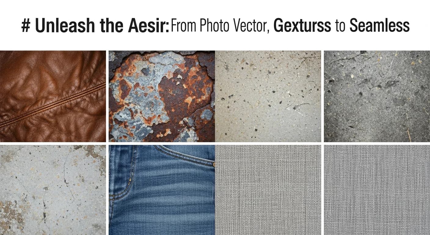
Grunge is the workhorse — photograph concrete, rust, peeling paint, or crumpled paper. Halftone evokes golden-age print; shoot old newspapers or vintage comics. Watercolor is the hardest to vectorize well but the most rewarding — paint actual washes on thick paper, photograph them, then trace. Fabric textures (burlap, denim, linen) are essential for fashion and packaging. Wood grain vectors are surprisingly popular for craft beer labels and rustic branding. Stone textures convey permanence and luxury, vectorizing best when you isolate vein or crack patterns against clean backgrounds.
Photographing Textures for Vectorization
Pro Tip: High-contrast photos vectorize best. Before tracing, push your image to near-black-and-white with strong contrast. Muddy midtones create messy, over-complicated paths that bloat file sizes and look terrible at any scale. Spend 30 seconds cranking contrast in your phone's photo editor and you'll save 30 minutes of path cleanup later.
- Shoot perpendicular to the surface — angle distortion ruins texture consistency
- Use diffused, even lighting — harsh shadows become unwanted vector shapes
- Fill the entire frame with texture, no background visible
- Shoot at maximum resolution — you can reduce detail but can't add it back
- Bracket exposures — take multiple shots so you have options when adjusting contrast
Post-processing before vectorization: Desaturate fully, push contrast aggressively with Curves, crush blacks and blow whites with Levels, crop tightly to remove non-texture areas, and apply a slight sharpen to define edges the tracer will follow.
A Full Year of Conversions for $49
Starter Annual: 25 conversions every month, $49 for the whole year. That is about $4.08 a month · Cancel anytime
Get the Annual DealStep-by-Step Vectorization Workflow
Step 1: Capture and Select
Photograph your texture source using the tips above. Review your shots and pick the one with the best contrast and most interesting pattern distribution.
Step 2: High-Contrast Preparation
Desaturate → 100%
Contrast  → +60 to +80
Levels    → Black: 30-50 | White: 200-220
Sharpen   → Unsharp Mask 50%, radius 1.5px
Step 3: AI-Powered Vectorization
Upload your prepared image to VectoSolve. The AI tracer analyzes texture patterns and generates optimized SVG paths. Use higher detail settings for textures — you want to preserve the organic irregularities that give the texture its character.
Step 4: Refine in the SVG Editor
Open your result in the VectoSolve SVG Editor to clean up:
- Delete stray micro-paths that add file size without visual impact
- Simplify paths where excessive anchor points don't contribute to the feel
- Group related texture elements for easier manipulation later
- Test at multiple zoom levels to ensure it reads well at different scales
Step 5: Create Density Variations
From your base texture, create three versions: Heavy (full density for dominant areas), Medium (50-60% paths removed for supporting texture), and Light (sparse version for subtle background grain).
SVG Filter Effects for Procedural Textures
Sometimes you don't need a photograph at all. SVG's built-in filter primitives can generate textures procedurally using code — incredibly powerful for web designs.
<filter id="grain-texture">
  <feTurbulence type="fractalNoise"
    baseFrequency="0.65" numOctaves="3"
    stitchTiles="stitch" />
  <feColorMatrix type="saturate" values="0" />
</filter>
Change baseFrequency to control grain size (higher = finer) and numOctaves for complexity. Pair with feDisplacementMap to warp vector shapes organically:
<filter id="vintage-texture">
  <feTurbulence baseFrequency="0.9" numOctaves="4" seed="2" />
  <feDisplacementMap in="SourceGraphic" scale="3" />
</filter>
This creates a vintage print effect that's resolution-independent and weighs almost nothing compared to raster textures.
Warning: Complex textures can bloat SVG file sizes dramatically. A detailed grunge texture might produce thousands of paths totaling 2-5 MB — larger than the original photograph. Always simplify paths after tracing. For web use, keep texture SVGs under 200 KB by reducing path complexity. For print, files over 10 MB will slow down Illustrator and InDesign noticeably.
Real-World Applications

T-Shirts and Apparel
Distressed vector textures on type and graphics communicate that coveted vintage aesthetic. Since screen printing requires vector separations anyway, textured vectors fit the production pipeline perfectly.
Posters and Print Design
Concert posters, movie posters, editorial layouts — texture transforms flat vector illustration into something that feels hand-crafted. Layer subtle paper grain across your entire composition, then add heavier grunge to focal areas.
Packaging Design
Craft brands benefit enormously from vector textures. A kraft paper texture on a beer label or coffee bag communicates artisanal quality, and because the textures are vectors they scale perfectly from sample labels to production runs at any size.
Web and Digital Design
Use SVG textures as CSS backgrounds, hero section overlays, or animated elements. The feTurbulence approach is especially powerful here — zero additional HTTP requests and the texture renders perfectly on Retina displays.
Building a texture library is a long game. Aim to add 2-3 new texture vectors per week. Organize by family (grunge, fabric, organic, geometric) and density (light, medium, heavy). Within a few months you'll have a personal collection that no stock site can match — because it reflects your eye and your aesthetic sensibility.
| Texture Type | Source Photo Tip | Trace Method | Typical Path Count |
|---|---|---|---|
| Grunge / distressed | High-contrast concrete, rust, peeling paint | Threshold + auto-trace | 500–3,000 |
| Halftone dots | Printed newspaper close-up | Bitmap mode + trace | 200–1,500 |
| Watercolor wash | Wet paint on cold-press paper | Multi-color trace (8–16 colors) | 1,000–5,000 |
| Fabric weave | Macro lens on linen or canvas | Line art trace + pattern tile | 300–2,000 |
| Wood grain | Sanded plank, side-lit for contrast | Grayscale trace (6–8 shades) | 800–4,000 |