Color Separation for Screen Printing: From Customer JPG to Films
Customer JPGs hide thousands of stray colors in anti-aliased edges. The spot-color separation workflow that caps the palette before you ever burn a screen.
Founder of VectoSolve
Self-taught developer, founder and sole developer of VectoSolve since 2024. He builds the conversion engine and the cutting, embroidery and 3D printing exports.
How this article was made: drafted with AI assistance, then edited and fact-checked before publication. About the author
Try it on your own file, in Screen Print mode
Free preview, no signup. Drop an image and see the vector before deciding anything.
The workflow below starts from a raster file — the image to vector converter is the step that turns the customer JPG into separable shapes.
What spot-color separation actually means
A screen press prints one ink through one screen. If a design uses four colors, you burn four screens, mix four inks, and register four screens on press. Spot-color separation is the prepress step that turns one piece of artwork into that stack: one clean, solid shape layer per ink, ready to output as film positives.
This is different from four-color process (CMYK halftones layered to simulate a full-color image) and from simulated process (halftones of several spot inks, used for photorealistic garment prints — a technique that, according to ScreenPrinting.com, Ryonet's supply arm, has largely displaced CMYK for photographic and tonal designs on garments). For the everyday jobs that keep a shop running (logos, event shirts, team prints, merch), spot color is the default. The trade press agrees on just how default: Scott Fresener's separation primer in Impressions Magazine calls spot color "the bread and butter of the industry" — logos, school designs, clip art, cartoons, anything with hard edges — and notes those separations are built in vector programs like Adobe Illustrator or CorelDRAW, which is exactly why the workflow below starts by vectorizing. ScreenPrinting.com is blunter still: spot color is "the most common print technique in the industry." Opaque inks in a handful of colors print cleaner on fabric than process work, and the customer usually thinks of their design as "three colors" anyway.
The problem is that the file they send you almost never contains three colors.
Why the customer's JPG is the enemy
Ask a customer for their logo and you will get a JPG exported from a website, a phone photo of a business card, or a Word document with the image pasted in. All raster, none of it separable as-is.
Two things poison a raster file for spot-color work:
Anti-aliasing. Every edge in the image is smoothed by blending the two adjacent colors across several pixels. A red shape on a white background does not meet the background at a hard line; it passes through a ramp of pinks. Multiply that by every edge in the artwork and a design the customer honestly describes as "three colors" contains thousands of distinct RGB values. An 8-bit RGB image can hold 16,777,216 possible colors (256 x 256 x 256), and anti-aliasing samples freely from all of them.
JPEG compression. JPEG compresses in 8 x 8 pixel blocks and discards high-frequency detail, which produces ringing and mosquito noise exactly where you care most: around sharp edges and text. Those artifacts are yet more stray colors, and they do not sit neatly along edges where a simple selection could catch them.
You cannot burn a screen from that. Every one of those in-between pixels has to end up assigned to an ink or discarded, and doing it by hand with magic-wand selections leaves fringed edges, stair-stepping, and orphan pixels that show up as garbage on film.
The workflow: cap colors first, then split
The order of operations matters. Separate a raster image directly and you inherit every anti-aliased pixel. Vectorize it first with a hard limit on the palette, and the separation step becomes trivial, because the file contains no more colors than you have screens.
Step 1: vectorize with a hard color cap
Run the image through the screen print file converter, which has presets built for this job: pick the one that matches your screen count (1-2 colors for budget runs, 3-4 for standard spot work) and the vectorizer merges near-duplicate shades down toward that budget. For an exact limit, use the hard color cap: set a maximum number of colors (the max-colors control in the full converter, or the colors parameter in the API) and the vectorizer is forced to express the entire design in at most that many flat fills. Every blended edge pixel snaps to one of the allowed inks, and the ramps of anti-aliased pinks collapse back into the red they came from.
Set the cap to the number of screens the job supports. If you quoted three colors, cap at three. The output is an SVG of solid fills with hard vector edges instead of pixel blends. Zoom in and check the edges and the smallest text before you go further; if the source image was tiny or badly compressed, this is where you find out.
Step 2: split into one file per ink
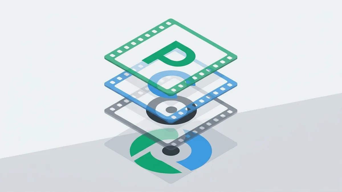
Feed the capped SVG to the SVG color separator. It splits the file by fill color and returns a ZIP with one SVG per ink. Each file contains every shape that prints in that color and nothing else.
From there you are in familiar territory: fill each separation solid black in your layout or RIP software, add registration marks and job info, and output film positives at print size. The separator gives you the per-color geometry; marks, trapping, and film output remain your job.
The film end of the chain has hard specs of its own. Epson's dedicated Screen Print Edition printers — the 17-inch SureColor P800SP and 24-inch T3270SP, bundled with the AccuRIP Black Pearl SE RIP — are rated for solid and halftone film positives up to 65 lines per inch, with black density up to 4.0 Dmax and high UV opacity, at up to 24 films per hour on the T3270SP, according to Epson's launch announcement. Those numbers are the bar any film route has to clear: if the black on your positive is not dense enough to block UV during exposure, clean separations still burn muddy screens.
Step 3: turn gradients into halftones
Spot color cannot print continuous tone. If the artwork has a fade, a glow, or a soft shadow, a solid-fill separation will either flatten it into a hard band or lose it. The honest options are to redraw the gradient as a hard-edged shape, drop it, or halftone it. Halftoning a spot ink is standard practice, not a workaround: as ScreenPrinting.com puts it, spot colors print as solid shapes at 100% tint or as halftones at anything less.
The halftone generator converts a gradient into dots of a single ink so the tonal ramp survives as printable geometry. Sizing the dots is a physical constraint, not a style choice: the dots must be large enough for your mesh to hold. Chromaline, which manufactures the films and emulsions this artwork eventually lands on, publishes the rule of thumb: multiply the halftone line count by 4.5 to estimate the lowest suitable mesh count — 45 lpi x 4.5 = 202.5, so the closest real screen is a 195/200 mesh — the margin that keeps the dot pattern and the mesh pattern from interfering as moire. The same article warns that tensioning elongates mesh by 4-8%, so the effective thread count on press runs lower than the number on the frame. This is why garment halftones run coarse compared to paper printing. Coarse dots print reliably; fine dots wash out of the screen or clog on press.
A Full Year of Conversions for $49
Starter Annual: 25 conversions every month, $49 for the whole year. That is about $4.08 a month · Cancel anytime
Get the Annual DealWhy a hard cap beats threshold-based reduction
Most automatic color-reduction tools work on a threshold: merge any two colors closer than some perceptual distance. That sounds reasonable and is the wrong model for screen printing, because it makes the final color count an output of the algorithm instead of an input from your quote.
Screen printing costs scale per color, and each color is not an abstraction. It is one screen coated, exposed, washed out, and dried. One more registration to dial in on press. One more ink to mix, one more stroke per shirt on a manual press, and one more screen to reclaim at the end. A seven-color job carries seven of everything whether you print 20 shirts or 500. When you quoted the customer three colors, "the algorithm decided five" is not a rounding error; it is two unbudgeted screens.
The fees are not abstract either; they sit on any shop's public rate card. Hemlock Ink charges a one-time $15 per screen, waived on reorders within a year, and burns a separate screen for each color in each print location — their own worked example: a two-color front plus a one-color back is three screens, $45 of setup (Hemlock Ink pricing page). Branded Screen Printing in Reno scales it with the count: $30 setup for one color, $5 per additional color up to $65 at eight, charged once per order, because "each color in your design requires a separate screen, and each screen has its own setup fee" (Branded Screen Printing pricing guide). Raygun Printing in Brooklyn itemizes the whole stack: $30 per spot color for the screen (stored up to three months), $15 per color for the film positive, $10 per color for Pantone matching, and $15 per screen on reorders inside the storage window (Raygun Printing price guide). Across those three shops, every color your separation adds puts $15 to $30 of setup on the invoice before a single shirt prints — and at Raygun, an uninvited fifth color also means another film and, if it needs matching, another Pantone fee.
| Question | Threshold-based reduction | Hard color cap |
|---|---|---|
| How many colors come out? | Unpredictable; depends on the image | Never more than the number you set |
| Matches the quote? | Only by luck | By construction |
| Two near-identical blues in the source | Often both survive | Forced to merge into one ink |
| Anti-aliased edge ramps | May survive as extra "colors" | Snap to the nearest allowed ink |
| Where the decision lives | Inside the algorithm | On your quote sheet |
There is a second, subtler failure in threshold reduction: it merges by color distance, not by importance. Two blues that differ by a hair (a compression artifact, not a design decision) can both survive because each covers a large area, while a small accent color gets absorbed into a neighbor. A hard cap forces a global decision: given four inks, which four best cover this artwork? That is the same shape of question you answer when you quote the job.
What this workflow does not do
Being straight about the limits saves you a bad film run:
- No trapping or choke. The separations butt-register. If your press or substrate needs trap, build it in your RIP or vector editor.
- No Pantone matching. The palette is derived from the image, and the image came from a customer monitor you have never seen. Match inks at the bench, against a physical reference if the customer has one — the current Pantone Formula Guide (GP1601B) carries 2,390 spot colors on coated and uncoated stock, each with the ink formulation to mix it, according to Pantone's own store listing, and that swatch book, not a screenshot, is what "PMS 186" actually means.
- No automatic underbase. Printing on dark garments usually needs a white underbase; generate it yourself, typically as the union of the color layers, choked slightly.
- No simulated process. Photographic or heavily airbrushed artwork is a different discipline with its own separation techniques. A hard cap will posterize a photo, which is occasionally a look and usually a complaint.
- Garbage in, limited out. A 200-pixel logo scraped from a website will vectorize, but no tool reconstructs detail that was never in the file. When the source is that bad, redrawing or asking for better art is sometimes the honest answer.
When to quote DTF instead
The per-color math cuts both ways. Because screens, registration, and reclaim are fixed per color, spot-color screen printing gets cheaper per shirt as quantity grows and more expensive as color count grows. A one-color print at 300 pieces is where the process shines. An eight-color design at 15 pieces is where it hurts: eight screens of setup amortized over fifteen shirts — at the shop rates quoted above, anywhere from $65 (Branded Screen Printing's flat eight-color schedule) to $240 in screen charges alone at Raygun's per-color rate, before films.
DTF transfers carry almost no per-color setup, so full-color low-quantity jobs that would be painful on press are routine there. If the capped output only starts looking right at eight or ten colors and the order is small, run the numbers before you burn anything; DTF vs screen printing cost walks through where the crossover sits.
Free SVG Tools for Crafters
Design Checker · Color Separator · Mat Preview · Offset Generator · Text to SVG
Check Your SVG FreeFAQ
How many colors should I cap at?
Cap at the number you quoted, which for most spot work is one to six. If the design looks broken at six colors, that is a signal about the artwork, not the cap: it needs simplification, a halftone treatment for its gradients, or a different process entirely.
Can I separate a photo this way?
You can cap a photo and it will vectorize, but the result is posterized: flat regions with hard edges. Sometimes that is a deliberate style. If the customer expects the photo to look like the photo, that is simulated-process or DTF territory, not spot color.
What do I actually send to film?
Each SVG from the separator ZIP, filled solid black, placed at print size with your registration marks, and output as a film positive (or sent to your computer-to-screen unit). The separator handles the per-color geometry; imposition and marks happen in your layout software.
What does the conversion cost?
You get one free watermarked vectorize preview a day with no signup to test artwork before committing. Beyond that, the Starter plan is $7.99 a month for 25 conversions, or $49/year for the same 25 a month if separations are part of your weekly intake.
Sources
- Impressions Magazine — Color Separations 101 (Scott Fresener) — trade-press primer calling spot-color separations "the bread and butter of the industry" and listing their typical artwork and vector tooling.
- ScreenPrinting.com (Ryonet) — CMYK vs. Spot Color vs. Simulated Process — spot color as the most common print technique in the industry; spot inks printed solid at 100% tint or halftoned below it; simulated process for photographic and tonal designs.
- Hemlock Ink — screen printing pricing — $15 one-time setup per screen, one screen per color per print location, waived on reorders within a year.
- Branded Screen Printing — pricing guide — setup schedule from $30 (one color) to $65 (eight colors), charged once per order, one screen per color.
- Raygun Printing — price guide — Brooklyn shop rates: $30 screen per spot color, $15 film positive per color, $10 Pantone matching per color, $15 per screen on reorders within 3 months.
- Pantone — Formula Guide Coated & Uncoated (GP1601B) — 2,390 spot colors in the Pantone Graphics System with ink formulations, on coated and uncoated stock.
- Epson US newsroom — SureColor Screen Print Edition printers — film-positive specs: solid and halftone films to 65 lpi, black density up to 4.0 Dmax, up to 24 films per hour on the T3270SP.
- Chromaline — Harmonizing Mesh Count to Line Count — the LPI x 4.5 minimum-mesh rule of thumb and the 4-8% mesh elongation under tension.
VectoSolve — AI-powered SVG platform: image-to-vector conversion, AI animation, brand identity generation, and more. https://vectosolve.com