Vectorizing a Painting: The Honest (and Complete) Guide to Image-to-Vector Conversion
Vectorizing a painting means interpreting it, not copying it. How tracers really work, how each medium behaves under conversion, how to prepare your capture — and when not to vectorize at all.
Founder of VectoSolve
Self-taught developer, founder and sole developer of VectoSolve since 2024. He builds the conversion engine and the cutting, embroidery and 3D printing exports.
How this article was made: drafted with AI assistance, then edited and fact-checked before publication. About the author
Try it on your own file
Free preview, no signup. Drop an image and see the vector before deciding anything.
We have to start with the uncomfortable sentence, because everything else follows from it: vectorizing a painting means losing part of what made it a painting. A canvas lives through its transitions, its material substance, the way light catches an impasto or passes through a glaze. The vector knows how to do none of that. It knows how to describe crisp shapes filled with flat colors, shapes you can scale up infinitely without losing a single pixel. Between the two, there is a choice to make, and this guide exists so that you make it with your eyes open.
We will look at how the algorithms really work (and why the received idea that "it all comes down to Potrace" is false), how color is handled, how to prepare an image so a tracer does not fabricate nonsense, why each medium behaves differently under a vectorizer's eye, what format really comes out of each machine, and above all: when to vectorize, and when you absolutely should not.
If you want to try the conversion on your own painting as you read, the image to vector converter is the tool this guide describes.
The Heart of the Problem: Finite Against Infinite
A raster image is a discrete, bounded sampling. A fixed grid of pixels, each carrying a color value, typically 8 bits per channel, meaning up to 16.7 million possible colors in 24-bit RGB. Careful, that number is an encoding capacity, not a content: a photographed painting does not contain 16.7 million colors, but on the order of tens to hundreds of thousands of unique colors actually present, plus continuous transitions between them.
The vector, on the other hand, does not describe pixels. It describes geometric objects: Bézier paths, fills, strokes. It has no resolution of its own, so you can resample it at any size. That is its strength and its limit: to exist, it must reduce a rich signal of tens of thousands of colors down to a small number of flat color regions.
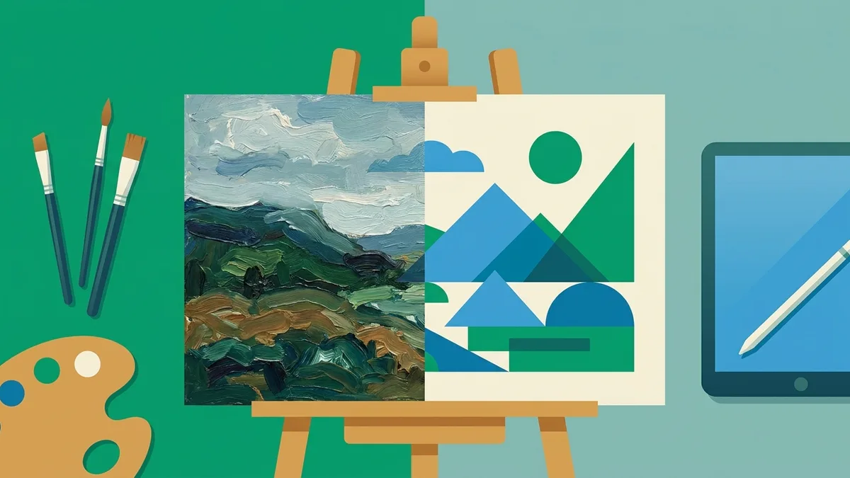
The raster-to-vector pass is therefore not a neutral conversion. It is a lossy re-description. You do not "convert" a painting into a vector, you make an interpretation of it in flat areas. Keep that sentence in mind, it is the only real frame for the subject: vectorizing a painting is not copying it, it is interpreting it.
How a Vectorizer Really Works
A vectorizer does not see paint. It sees a grid of pixels and it looks for boundaries: contrast jumps sharp enough to lay a path on. Anything that creates a clean boundary makes its job easier. Anything that dissolves the boundary, the transparency, the fade, the granulation, the grain of the support, the gloss of the varnish, makes its job harder. This is the physical principle that explains all the medium-by-medium behavior, which we will come back to.
The real chain has three links: the capture, the color quantization, then the tracing. The ease of a vectorization is often decided in the first two, that is, before the tracer even enters the scene.
The Two Main Families of Methods
The first family is contour tracing, or the region-based approach. You first quantize the image into N colors, then trace the contour of each region into Bézier paths. The result: flat areas, a light file, an editable SVG. This is what nearly all consumer tools do.
The second family is the gradient mesh. You lay down a deformable control grid where each node carries a color, which allows continuous gradients to be reconstructed. The foundational reference is the paper by Sun, Liang, Wen and Shum, "Image Vectorization using Optimized Gradient Meshes" (SIGGRAPH 2007, Microsoft Research). But let us be clear: in Illustrator, the gradient mesh is semi-manual and expensive. Reproducing a photographic area requires laying down and editing hundreds of nodes by hand. It is not a magic wand for vectorizing a whole painting, it is a local retouching tool, slow, "very time consuming" by the admission of the very tutorials that teach it. Nobody hand-meshes a complete canvas.
The Potrace Myth, and What Is Actually True
You read everywhere that Potrace is "behind almost everything." That is false, and the nuance matters for understanding your results.
Potrace (Peter Selinger, algorithm published in 2003, latest stable version 1.16 in 2019, under GPL license) is indeed the reference engine of the open source desktop ecosystem: Inkscape (the Path then Trace Bitmap menu), FontForge for importing a bitmap into a font, LilyPond for music engraving, SVGcode, autotrace. But that is all. Modern color vectorizers do not use it:
- VTracer (visioncortex) has its own engine written in Rust, with a true native color pipeline. No Potrace.
- Adobe Illustrator Image Trace is a proprietary Adobe implementation, conceptually close but coded separately, with, for a few versions now, preprocessing by Adobe Sensei (subject/background detection, palette clustering, denoising) while the curve generation remains mathematical.
- Recraft, Vectorizer.AI and the other neural vectorizers generate Bézier curves directly via trained neural networks. This is not binary contour tracing.
The honest formulation is therefore: Potrace is the historical and most widespread engine of free desktop tools for black and white, but today's color and AI vectorizers rely on their own engines.
What Potrace Does, Step by Step
Understanding Potrace remains useful, because its pipeline is public and it underpins Inkscape, which many people use. Four steps:
- Path decomposition. The bitmap is decomposed into closed paths that form the boundaries between black and white zones. This is where the anti-noise parameter comes in.
- Optimal polygon. Each pixel staircase is approximated by the polygon that has the fewest segments while staying "straight" according to a penalty criterion, before an adjustment of the vertices to minimize the error.
- Curve smoothing. Each vertex becomes either a sharp corner or a smooth cubic Bézier curve.
- Curve optimization. Potrace merges, when possible, consecutive Bézier segments of the same convexity, never straight segments or corners.
Three parameters govern all of this, and their default values are often misquoted:
- turdsize (default 2) removes specks of pixels below N pixels. It is the anti-fleck net, intervening from step 1.
- alphamax (default 1.0) decides corner against curve. At 0, no smoothing, the output is a raw polygon. Above 4/3 (about 1.333), all corners disappear, the output is entirely smooth. The useful range therefore goes from 0 to 1.333. This is the setting that decides whether your brushstrokes keep their angles or turn organic.
- opttolerance (default 0.2) tunes the aggressiveness of the curve merging. The larger it is, the more segments merge, at the cost of precision.
Crucial point for a painting: Potrace's input is strictly black and white. The man page says it word for word, the input is a bitmap composed of the two colors black and white only. A color image is first converted to grayscale then thresholded. Potrace never handles color natively, ever.
How Color Appears Anyway With Potrace
In Inkscape, color does not come from Potrace but from a stack layered on top of it. The "Colors" mode decomposes the image into several black-and-white passes (by posterization or by separation of brightness levels), traces each pass separately, then stacks the layers. It is multi-pass, slower, and it generates redundant paths with visible seams between zones. For a multicolored continuous-tone painting, this is precisely the worst scenario: Inkscape will produce stacked bands and a heavy manual cleanup.
This is where native color engines take the lead. VTracer, Adobe Image Trace and the AIs cluster the color directly (often in LAB space) and stack solid shapes instead of cutting holes. This stacking strategy gives more compact SVGs, with no holed shapes, therefore cleaner and more editable for reproducing a painting.
Why VTracer Is Fast, and the Research Frontier
VTracer deserves a technical note: its pipeline is O(n) where Potrace runs in O(n²) on its fitting step. On a large high-resolution painting scan, the difference is tangible, all the more since the Inkscape-style multi-pass pipeline multiplies the cost again. VTracer offers three fitting modes (pixel, polygon, spline) and bw, poster, photo presets.
Beyond consumer tools, research is exploring a radically different path: vectorization by differentiable optimization. DiffVG (Li et al., SIGGRAPH Asia 2020) introduced the first differentiable rasterizer, which allows Bézier curves to be optimized by gradient descent by comparing the render to the target result. LIVE (CVPR 2022) builds the SVG layer by layer on top of DiffVG, with clean topology but a prohibitive cost: about five hours to vectorize a 2K image. Add to this VectorFusion, DiffSketcher, LayerTracer and Bézier Splatting. These methods do not trace a contour, they reconstruct or generate curve parameters directly. This is the state of the art, but it is still too slow for the general public. Honesty about the real state of things: it is not in your tools today.
A clarification that will be useful later: people sometimes speak of "splines" in the settings, but the SVG format knows only Bézier curves, quadratic (Q) or cubic (C). Any spline ends up translated into Bézier at export. The spline is a fitting term, not a storage format.
Color: The Real Science Behind the Flat Areas
This is the step that turns a painting into something traceable, and it is where almost everything is decided. It is separate from and upstream of the tracing: Potrace never sees color, the quantization is done beforehand by another stage. Understanding this stage is what separates a real guide from a tutorial.
Quantizing Means Choosing a Palette
Quantizing means reducing the tens of thousands of colors of a painting to a handful of representative colors. Three families of algorithms share the work, with clear tradeoffs.
Median cut (Heckbert, MIT 1980) builds a 3D histogram of colors, then recursively splits the color "box" along its widest axis, at the median, until you get K boxes each containing roughly the same number of pixels. It is the historical GIF algorithm. Robust and simple, but its cut at the median balances counts and not variance: a small red accent, rare but visually crucial, can be crushed.
Octree (Gervautz and Purgathofer, 1988) inserts each color into an eight-branch tree and merges the least populated nodes when the palette exceeds K. Its decisive advantage is being O(N) in a single pass, with a memory footprint bounded by the palette and not by the image. It is the ideal algorithm in streaming, low memory, real time. Quality slightly below k-means, the merging being constrained by the octree's grid.
K-means assigns each pixel to the nearest centroid, recomputes the centroids, and starts again. It gives the best fidelity because it minimizes the squared error, but it is the slowest and non-deterministic (the result depends on the initialization; k-means++ stabilizes it). Long judged too expensive, it was rehabilitated around 2011 by optimized implementations.
In practice: median cut and octree to preview quickly and "see" a palette, k-means when fidelity matters more than speed. The reference survey is "Forty years of color quantization" (Artificial Intelligence Review, 2023).
| Algorithm | Complexity | Memory | Fidelity | Deterministic |
|---|---|---|---|---|
| Median cut | near-linear | fixed histogram | medium | yes |
| Octree | O(N), one pass | O(K), excellent | medium | yes |
| K-means | iterative, slower | proportional to the data | the best | no (without seed) |
The Counterintuitive Point: Quantize in LAB, Not in RGB
Here is the argument that separates the expert from the amateur. The RGB space is not perceptually uniform. Two pairs of colors separated by the same Euclidean distance in RGB can be perceived as very differently spaced, because the eye is ultra-sensitive to greens and barely sensitive to dark blues. A straight line in RGB becomes a curve in perception.
The CIELAB space is designed so that the Euclidean distance approximates the perceived difference. And k-means assumes precisely a Euclidean space. Running k-means in LAB therefore gives palettes that stick to human perception, with lower errors than in RGB. The rule: you do not quantize in the space where you store (sRGB), you quantize in the space where you perceive (LAB). Many tools naively merge colors on an RGB threshold, which over-merges or under-merges depending on the hue.
Delta-E: Deciding Whether to Merge Two Colors
To know whether two colors can be merged into one, you measure their perceptual gap, the Delta-E. The reference scale:
- ΔE less than or equal to 1: gap not perceptible to the naked eye. Always safe to merge.
- ΔE from 1 to 2: perceptible only on close inspection. This is the critical quality benchmark. Safe to merge to reduce a palette.
- ΔE from 2 to 3.5: perceptible but acceptable for most uses, common branding tolerance.
- ΔE from 2 to 10: perceptible at first glance. Colors to keep distinct above 3.5.
- ΔE near 100: opposite colors.
Two formulas circulate. CIE76 is a simple Euclidean distance in LAB, which overstates the gap of saturated colors and understates dark blues. CIEDE2000 is the current standard, which weights lightness, chroma and hue separately. It is this metric, and not the naive RGB distance, that you should use to decide on a merge.
Posterization Against Quantization
The two are often confused. Quantization reduces the total number of unique colors. Posterization reduces the number of steps per channel, which produces clean bands. For contour tracing, posterization is not a flaw: it is the necessary stance that turns a continuous-tone painting into a finite number of traceable zones. A continuous gradient is not traceable in flat areas, full stop. Smoothing and then laying four levels gives a clean, deliberate poster effect.
The Dithering Trap
Golden rule: never enable dithering before a vector trace. Dithering (Floyd-Steinberg in error diffusion, or ordered/Bayer) breaks the banding by simulating more colors than there are, by scattering micro-dots. It is a raster technique, perfect for a photo on display. But on a flat-area output, it generates a swarm of micro-dots, meaning thousands of unmanageable paths. Dithering before a trace is a trap. Its legitimate equivalent exists, but on the production side: it is the halftones handled by the RIP at print time, not in the SVG.
The Gamut, the Blind Spot
A detail people forget: LAB encompasses everything visible, sRGB covers only a fraction of it, and screen printing or CMYK even less. A saturated oil or acrylic color may simply be out of the printable gamut. Quantization should therefore aim for reachable colors (real inks, Pantone), not only the most faithful to the screen. Otherwise, you validate on screen a color that will never exist on the support.
A Full Year of Conversions for $49
Starter Annual: 25 conversions every month, $49 for the whole year. That is about $4.08 a month · Cancel anytime
Get the Annual DealPreparing the Image: What Happens Before the Trace
The best tracer setting will never save a bad preparation. Here is the order of the pipeline, and why each step matters.
Anti-Aliasing Sabotages the Trace
Anti-aliasing fills the pixels partially covered by an edge with intermediate values. A black line on a white background thus generates a fringe of gray. Even a "clean" drawing contains dozens of gray levels along its contours. For the tracer, this is a catastrophe: the quantization files these grays into a distinct bucket and creates parasitic micro-regions along each edge, hence the staircases and halos. The canonical halo appears when two neighboring colors are blended by the filter: a red-to-blue transition leaves a purple fringe, traced as a phantom third color. On a painting, these transition pixels are everywhere, because of the sensor and the compression.
The JPEG Trap
JPEG compression creates color shifts around edges, the ringing and the blocking in 8x8 pixel blocks. Vectorizers trace these shifts as jagged edges and paths absent from the original. Simple reflex: convert and work in PNG before any trace. Never re-vectorize a photo of a painting that has gone through multiple JPEG re-encodings.
The Filter Decision Tree
The wrong reflex would be a Gaussian blur. It is contraindicated just before a trace: it weights only by spatial distance, blends blindly across edges, and turns a clean edge into a ramp of intermediate pixels, which is exactly the flaw we are trying to remove. You need a smoothing that preserves edges.
Median filter. It replaces each pixel by the median of its neighborhood. It totally removes salt-and-pepper noise (a Gaussian, by contrast, only spreads it out), preserves edges and contrast better, and it is the tool for isolated speckles, scan dust, dead pixels. Limit: a large window over-smooths and rounds corners.
Bilateral filter. It is a Gaussian with two kernels: a spatial kernel (sigma_d, only nearby pixels count) multiplied by an intensity kernel (sigma_r, only pixels of similar color count). Neighbors on the other side of an edge get an almost null weight and are excluded from the average. The edge is preserved while the interior is flattened. This is exactly what you want on a painting: flatten the canvas grain or the micro-variations of a gouache flat area without softening the silhouette of the shapes. Increasing sigma_d smooths larger structures; increasing sigma_r gradually degenerates toward a plain Gaussian blur.
The bilateral has two flaws to know. The "staircase effect" creates intensity plateaus that give a cartoon look. In vectorization this is often desirable, we want flat areas, but in excessive doses it invents steps. The "gradient reversal" introduces false edges, especially in base-detail decomposition.
Guided filter (He, Sun, Tang, 2013). Same edge preservation as the bilateral, but in linear complexity (independent of the radius) and without gradient reversal. It is the modern replacement when you want to flatten a large image cleanly without inventing false edges.
In short: isolated speckles, median; flatten a surface while keeping edges, bilateral; same need on a large image or to avoid false edges, guided filter; never a Gaussian blur before a trace.
The Right Resolution Is Calculated, It Is Not Stacked Up
Potrace is designed to work well on high-resolution images, but "bigger is better" is false. The sweet spot for tracing is around 1000 to 2000 pixels on the longest side. Beyond that, you do not improve quality, you bloat the SVG (AI vectorizers often produce SVGs with 10,000 anchor points and more) and you increase the risk of a crash.
The right target is calculated from the final print size, not by stacking up pixels:
source_pixels = print_width_cm / 2.54 × target_DPI
The gold standard for print is 300 DPI at final size, 200 DPI the acceptable minimum, 72 DPI reserved for screen. To print a 30 cm wide reproduction at 300 DPI, you need about 3540 pixels of width in the source. If your photo is below that, an upscale, ideally by AI, gives the tracer sharper edges to follow. The upscale does not create real detail, but it prevents the tracer from staircasing an undersampled edge.
Despeckle, Before and After
Before the trace, on the binary mask, classic morphology cleans up: opening (erosion then dilation) removes small isolated dots, closing (dilation then erosion) plugs micro-holes and reconnects a fragmented line. During and after the trace, Potrace's turdsize parameter (default 2) removes any path whose area is below N pixels. Raising it throws away noise specks, isolated canvas grain and residual artifacts instead of vectorizing them.
The Order, Which Makes All the Difference
- Convert to PNG if the source is JPEG.
- Upscale if you are below the calculated target resolution.
- Denoise: median for speckles, bilateral or guided to flatten grain and brushstrokes.
- Quantize the color, in LAB.
- Trace.
- Only after: despeckle (turdsize), path simplification.
The rule that sums it all up: you smooth before quantizing, never after, and a slight smoothing before posterization makes the bands clean.
Medium by Medium: The Physics of Ease
The principle is set: the vectorizer looks for contrast boundaries. Opacity plus flat area equals clean boundary, therefore easy. Transparency, fade, granulation, support texture, varnish gloss, all of these are dissolved boundaries, therefore hard. Two physical mechanisms underlie the difficulty. Transparency comes from subtractive optical stacking (Beer-Lambert law: the perceived color is the product of all the underlying layers, with no discrete zones). Granulation comes from pigment size: fine equals smooth, coarse and irregular equals speckled.
A factor too often forgotten: the capture. The specular reflection of a varnish or a glossy finish can literally mask the image. The professional countermeasure is cross-polarization, a polarizing filter on the lens and on the lamps, which lets you see through the varnish and capture the pure pigment.
Ink and Line Drawing: The Easiest
Physics: ink is a dense, opaque, high-contrast pigment on white paper, binary in effect. Maximum ease. You keep the pure line, infinitely scalable, with the option of a centerline trace (a single path at the center of the stroke, not a closed contour), ideal for cutting and engraving. You lose little, except the variable thickness of the stroke in centerline. Key setting: the black/white threshold, and the choice of centerline against outline. To know: aim for a pen of at least 0.5 mm, because strokes of 0.1 to 0.3 mm fragment at common scan resolutions. Avoid graphite, which reflects light irregularly and produces inconsistent gray values that confuse the threshold algorithms. Ink before scanning.
Gouache: The Champion of Paints
Physics: gouache is a watercolor loaded with white, therefore opaque, and above all self-leveling, drying to a matte surface with no gloss. At capture, no specular to manage: the scanned color is the true color of the pigment, stable across the whole flat area. Very high ease. You keep the clean flat areas and the crisp boundaries; you lose almost nothing if the artist painted in flat areas, just the micro-variations of the brush. Key setting: the number of colors in the palette, raised just enough to cover the real flat areas. The matte finish and the absence of gloss make gouache markedly easier to digitize than glossy acrylics.
Acrylic: Easy, But the Finish Decides
Physics: acrylic is opaque like gouache, but its binder often dries to a satin or glossy finish, hence specular reflections that pose false light zones. Nuance: acrylic gouache (Liquitex, Holbein) dries matte, with no brush marks, therefore as easy as gouache. High ease if matte and in flat areas, medium in glaze or glossy impasto. You keep flat areas and contours, you lose the modeling of glazes and the texture of the impasto. Key setting: capture in cross-polarized light to kill the reflection, before anything else. It is the finish, not the chemistry, that degrades.
Oil: The Hardest of the Opaque Paints
The difficulty is mostly optical, not chromatic. The impasto is in 3D relief, and the raised zones catch the light differently: the same pigment returns five values depending on the angle, which the quantization reads as so many parasitic colors. The glossy varnish adds a major specular reflection. The glazes add continuous fades. Low to medium ease. You keep the large masses if you simplify heavily; you lose the material substance, the transitions, the depth effect. Key setting: capture in cross-polarization to see through the varnish, otherwise you trace the reflections and not the painting, then smoothing and controlled posterization.
Watercolor: The Emblematic Hard Case
Two distinct mechanisms, not to be confused. The transparency: pigment diluted in translucent layers, continuous gradients with no boundary, therefore forced posterization or an explosion in the number of paths. The granulation: the large irregular pigments (earths, ultramarines, cadmiums) clump together instead of settling uniformly, creating a speckled texture with micro-contrast that the algorithm reads as noise and over-traces into hundreds of micro-paths. Pigment rule: the finer the particles, the less it granulates (phthalos and quinacridones are smooth; earths, cadmiums and ultramarines granulate). The wet-on-wet edges are blurry, undefinable. Low ease. You keep the general atmosphere if you stylize heavily, you lose the transparency, the granulation and the fades, that is, the essence of the medium. Key setting: bilateral blur or noise reduction before tracing, plus a deliberate posterization.
Pastel: Hard Because of the Support
A unique case, where the difficulty comes from the paper. Pastel is pure pigment in powder held only by the tooth of the paper. Each grain of paper carries or does not carry pigment, hence a systematic speckled micro-texture, the weave of the support showing through, exactly the high-frequency noise that the algorithm over-traces. The "broken color" technique (layers that the eye blends optically) has, by definition, no clean boundary. Low ease. You keep the large tonal masses with heavy smoothing, you lose the velvety quality, the grain, the optical blending. Key setting: strong denoising or blur to drown the tooth of the paper, and a low number of colors, otherwise the file explodes into speckles.
Digital Painting: It All Depends on the Brush
"Digital" does not mean "clean." A hard raster brush at 100% opacity gives perfect flat areas, already pre-quantized, often the best case after ink. A textured brush, at low opacity or blended, poses the same problems as oil. Very high ease in flat and cel-shading, low in realistic textured painting. You keep flat areas and line art, you lose brush texture, grain, fades. Decisive key setting: if you control the file, export by flat-area layers and flatten the blurs before tracing. Painting or flattening into flat areas on the source side beats any setting on the vectorizer side.
Mixed Media and Collage: Segment
No global ease, it is local. A single work juxtaposes a watercolor wash (hard), an ink line (easy), a gouache flat area (easy), a textured glued paper (noise). A global setting always fails: the threshold that saves the ink destroys the watercolor, and vice versa. Medium ease at best. You keep the high-contrast elements, you lose the translucent or textured passages. Key setting: segment, vectorize zone by zone with different settings, then recompose. It is the only medium where the right "setting" is a working method, not a slider.
The Ranking, at a Glance
| Medium | Ease | Key setting |
|---|---|---|
| Ink / line art | Trivial | Threshold + centerline/outline |
| Digital flat / cel | Trivial | Export by flat-area layers |
| Gouache | Very easy | Number of colors |
| Matte acrylic / acrylic gouache | Very easy | Number of colors |
| Glossy acrylic | Easy (subject to capture) | Cross-polarization then palette |
| Oil in flat areas | Medium | Smoothing + posterization |
| Pastel | Hard | Strong denoising + few colors |
| Watercolor | Hard | Bilateral + deliberate posterization |
| Oil impasto / varnish / glaze | Very hard | Cross-polarization + strong simplification |
| Mixed / collage | Variable | Segment by zone |
Machine Export: The Exact Format, and the Real Trap
This is where a lot of substance goes in the bin, because people confuse the file format and what the machine really reads. We first have to set out three families of machines.
Family A, direct vector reading. The machine reads the SVG or the DXF and builds its own tool path: laser cutting and marking, Cricut and Silhouette, vinyle cutting plotters. The vector is the deliverable.
Family B, G-code tool path. The machine only runs a file generated by CAM software: CNC router, milling machine, plasma, water jet. The vector is only the first step; the machine never reads the DXF or the SVG, only the .nc, .gcode or .tap.
Family C, stitch file. Embroidery reads neither image nor vector, but a digitized stitch file.
Cricut and Silhouette (Family A)
Format: cut-ready SVG, DXF as fallback. The traps that waste the most material: paths must be closed, otherwise the machine draws instead of cutting; convert the strokes into fills, Design Space handling strokes poorly; no embedded raster in the SVG, a bitmap inside an SVG does not cut; details below 0.25 inch tear during weeding, especially in vinyle; any SVG whose longest side exceeds 12 inches is auto-resized to 12 inches by Design Space; DXF on Cricut is desktop and web only, not in the mobile app. On the Silhouette side, the free Basic edition does not open SVG at all: you need the Designer Edition, otherwise fall back to DXF. This is the number-one cause of "my SVG won't open."
Laser Cutting and Engraving (Family A)
LightBurn, the industry standard, imports AI, PDF, SVG, DXF, PLT, and rasters. Watch out for the received idea "the laser outputs G-code": that is true for GRBL and diode machines, but CO2 machines with a Ruida controller export a proprietary .RD file, not G-code. Useful DXF tip: saving as R12 automatically converts splines into polylines, because splines postdate R12, which purges the splines an old controller cannot read. Glowforge accepts SVG, PDF, JPG and PNG for everyone, but reserves DXF for Premium members. Traps: sending a raster while thinking you are cutting (a pixel has no path, the software only offers engraving), wrong units (inches read as millimeters), open paths, thick strokes where you wanted a fine cut line.
CNC Router and Milling Machine (Family B)
The vector is only step A. The three-stage pipeline: DXF or SVG in 2D (or STL/STEP for 3D relief), then CAM (Carbide Create, VCarve, Fusion 360) which adds tool diameter, pass depth, speeds, tabs, lead-ins and kerf compensation, then G-code that the machine runs. Most image-to-vector tools stop before this step; VectoSolve can export basic GRBL G-code (feed rate, passes, kerf), but tabs and lead-ins still belong in your CAM. DXF is preferred in 2D for its precise CAD units. Traps: a DXF with no unit information imports 25.4 times too big or too small; open or duplicate contours from an auto-trace (a stroke traced as two lines) prevent the CAM from knowing which side is the inside; 3D relief requires an STL or a STEP, a flat vector does not describe depth.
Plasma and Water Jet (Family B)
Preferred format: DXF. OMAX explicitly recommends DXF AutoCAD Release 12 in ASCII text, with everything exploded into simple lines and arcs (explode the polylines, explode the blocks). The machine runs the G-code generated by the CAM (SheetCAM, ProNest), which adds lead-ins, pierces, cut order and kerf compensation. Traps: splines left as splines (many controllers do not read them, convert to arc-fit polylines at about 0.02 mm tolerance), unexploded entities, duplicate lines, non-vectorized text, mm/inch confusion.
Embroidery (Family C)
The most misunderstood case. DST, PES, JEF, EXP, VP3 are stitch files, not vectors. An embroidery machine does not read SVG: you have to digitize. Digitizing translates shapes and colors into a sequence of stitches, each with direction, density and type, plus the underlay, the push/pull compensation, the stops and the trims. No vectorizer creates this. The "one-click SVG to embroidery" conversion is a marketing myth: at best, a clean SVG is a better starting point to import into Ink/Stitch, Hatch or Wilcom, where a human assigns the stitches. Note that DST (Tajima) is universal but stores no color, only stop codes: the colors are reassigned at the machine. For color-faithful work, use the native format (PES Brother, JEF Janome).
Screen Printing: For a Painting, the Vector Is Almost Useless
A capital distinction. A flat logo in flat areas gives vector spot separations, one screen per color, with named Pantone swatches. But a painting is a continuous-tone image: this is not vector work. It is simulated process or CMYK, done in Photoshop in raster with halftones, not in Illustrator. A few production benchmarks: the switch from spot to simulated process happens around 5 to 8 colors; the simulated uses 6 to 12 inks across 8 to 12 screens; the textile screen frequency is 45 to 55 LPI, much coarser than offset at 133-175 LPI, because of the mesh of the screen; the screen angles are offset by about 30 degrees to avoid moiré (in CMYK: K at 45, M at 75, C at 15, Y at 0, the clean residual pattern being called a rosette); trapping slightly overlaps adjacent zones to avoid white gaps at the slightest registration shift, by spreading the lighter color into the darker one. To reproduce a painting in screen printing, the vector is almost useless, it is a raster halftone workflow.
Sublimation, DTF, DTG: Raster, Not Vector
These are inkjet processes. The deliverable is a transparent PNG at 300 DPI at final size, in sRGB, not an SVG. Below 200 DPI the edges soften, below 150 DPI it is blurry. The raster is necessary for full-color photos and continuous tones, exactly the case of a painting. The RIP automatically generates the white underbase on dark textile. A vectorizer solves nothing about the deliverable here; the only useful contribution of a conversion tool is the raster upscale of a low-definition source.
Signage and Large-Format Vinyle
In cut-only, the vector is mandatory, the blade follows the path. In print-and-cut (Roland VersaWorks), the cut line must be a vector path whose stroke carries a named spot color exactly "CutContour", case-sensitive, saved as EPS. Without this exact name, the RIP prints the line instead of cutting it.
When Raster Beats Vector
The decisive point for a painting. To reproduce a continuous-tone canvas, subtle shadows and gradients in laser engraving, halftoning (dithering or grayscale) on a high-definition, high-contrast raster beats vector conversion. Error diffusion achieves better detail precision than ordered dithering, and the soft shadows render better without tracing the image. The vector in black-and-white or centerline mode only serves for pure line work and flat areas. So, for a painting, you engrave in halftoned raster; you only vectorize for a cut, a stencil, or a stylized flat-area version.
Free SVG Tools for Crafters
Design Checker · Color Separator · Mat Preview · Offset Generator · Text to SVG
Check Your SVG FreeDeciding: Vectorize, Upscale, or Leave It Alone
The Value Study First
Deciding the number of flat areas means deciding how many value steps (light, mid, dark) you keep. Doing the value study before the machine, that is, mentally reducing the painting to three or five large tonal masses, amounts to anticipating what k-means will produce and keeping artistic control instead of suffering it. In practice, count 3 to 5 flat areas for a deliberate graphic, poster-style stance, and 8 to 12 to stay closer to a "painting."
AI Upscale, the Honest Alternative
The rule is almost a consensus: what looks like a photo should not be vectorized. Continuous transitions force either a lossy posterization or an explosion in the number of paths and the file size. To simply enlarge a photographed painting without repixelating it, the right tool is not a vectorizer but a raster upscaler by super-resolution, which preserves gradients, grain and texture. Its limits: it can add grain in contrasty zones and generate very large files, sometimes rejected by certain marketplaces. But for a faithful print, it beats vectorization.
| Your need | The right tool |
|---|---|
| Cutting, engraving, large-format in flat areas | Vectorize |
| Faithful print of the painting as is | AI upscale (super-resolution) |
| Screen or web display | Optimized PNG or WebP (lighter than a 50,000-node SVG) |
| Reproduction of a continuous-gradient medium | Do not vectorize |
When Not to Vectorize, Owned
Do not vectorize to faithfully reproduce a continuous-gradient painting (glazed oil, watercolor, sfumato). Do not vectorize for a simple enlargement, take an upscale. Do not vectorize for the screen, an optimized raster will be lighter than a monstrous SVG. Do not vectorize when the posterized render betrays the artist's intent. Vectorizing is justified when the destination demands paths: vinyle cutting, laser engraving or cutting, color separation, logos and large-format merch.
The Tool Landscape (June 2026)
The prices below are verified in June 2026 and subject to change. The distinction that structures everything: some tools binarize and stack passes (Inkscape, Illustrator in historical logic), others work the color natively (VTracer, Vector Magic, Vectorizer.AI, the AIs). This is what explains why a painting comes out in bands with the former.
Inkscape / Trace Bitmap. Free, open source, on all systems. Potrace engine, therefore strictly bi-level; color is simulated by stacking passes, hence visible seams. For whom: zero budget, line art and black-and-white logos, designers ready to tinker. Not for reproducing a continuous-tone painting.
Illustrator Image Trace. Paid, by subscription, never sold alone: you need all of Illustrator, from 22.99 dollars a month on an annual commitment to 31.49 dollars monthly with no commitment. The most controllable tracer (presets, paths/corners/noise sliders, color modes). But it does not generate gradients (the gradients become flat areas), the upscale by autotrace fails, and the loss of detail is inevitable. For whom: pros already in the Adobe ecosystem who want to retouch the paths.
VTracer. Free, open source. Core in Rust, Python package, CLI, and a free WASM web demo in the browser, with no installation. True color pipeline, O(n) complexity, compact output by stacking. Limit: no official native GUI, oriented toward flat areas. For whom: devs, automated pipelines, fast and free color batch.
Vector Magic. Paid, two distinct products: online around 8.99 euros a month (EPS, SVG, PDF outputs), or desktop as a one-time purchase around 274 euros which adds AI and DXF outputs. Trial with full preview but saving disabled. Known for its auto-detection of settings and a clean render. For whom: a clean color result without the Adobe curve.
Vectorizer.AI. Paid, full color deep learning. Web app around 8.99 euros a month unlimited, with a free interactive preview before purchase; API by sliding-scale credits. SVG, PDF, EPS, DXF, PNG outputs. Sub-pixel color tracing, geometric shape adjustment. It is the most relevant full-color AI competitor for painting, with DXF available.
Recraft. Freemium. Limited free tier, then Basic at 10 dollars a month, Advanced at 27, Pro at 48. Does text-to-SVG and raster-to-SVG. Known for cleaner paths than Image Trace on simple sources, but struggles on complex images. Nuance: Recraft first generates an image then vectorizes it, this is not direct vector drawing.
VectoSolve. Paid: one file for 6.99 dollars, or a plan from 7.99 dollars a month, with one free watermarked preview a day. Its factual angle: it outputs machine-ready SVG and DXF directly, designed for direct cutting (Glowforge or xTool laser via LightBurn, Cricut and Silhouette cutters, Roland or Graphtec signage plotters, and CNC as a first step before CAM). To compare the target formats before launching a cut, its reference file formats page consolidates the machine-by-machine constraints. Honesty required: it does not generate G-code, does not digitize embroidery, does not build a 3D mesh. CNC still requires a CAM downstream, embroidery a digitizing software.
Rather than a "best tool" ranking, reason by use case: free and tinkering, Inkscape; pro control and retouching, Illustrator; free color and batch, VTracer; clean auto color, Vector Magic or Vectorizer.AI; generate and vectorize on the web, Recraft; machine-ready DXF output, VectoSolve.
How Big This Market Is, Honestly
The "thrown around" figures of tens of billions help nobody. Here are sourced orders of magnitude, with their ranges, because the firms diverge depending on their definition of the market.
Global print-on-demand in 2025 sits at the heart of estimates between 10.8 and 13 billion dollars (Grand View 10.78; IMARC 11.4; Mordor 12.15; Straits 12.39; Precedence 12.96), with a CAGR frequently cited around 24-25%. The personal cutting machine market weighs about 1.5 billion dollars in 2025, Cricut in the lead with annual revenue around 830-850 million. Laser engraving and cutting ranges between 2.4 and 7.4 billion depending on the scope used, with a CAGR on the order of 7.6 to 8.3%. And as a concrete proxy for the demand for vector files: Etsy's digital downloads segment did about 3.2 billion in sales in 2024, of which SVG cut files represent around 22%. It is a real, addressable market, not a vague aggregate.
A Full Year of Conversions for $49
Starter Annual: 25 conversions every month, $49 for the whole year. That is about $4.08 a month · Cancel anytime
Get the Annual DealGoing Further
The reference technical sources, if you want to dig deeper: Peter Selinger's Potrace documentation (the 2003 paper and the man page), the VTracer repository and README (visioncortex), the "Forty years of color quantization" survey (Artificial Intelligence Review, 2023) for quantization, the "Guided Image Filtering" paper by He, Sun and Tang (PAMI 2013) and the Wikipedia page of the bilateral filter for preprocessing, "Image Vectorization using Optimized Gradient Meshes" (SIGGRAPH 2007) for the gradient mesh, and DiffVG (SIGGRAPH Asia 2020) with LIVE (CVPR 2022) for the neural frontier. On the production side, the screenprinting.com resources on spot, simulated and CMYK, and the OMAX and LightBurn documentation for machine export.
FAQ
Can you really vectorize a watercolor?
Yes, but not reproduce it. You get an interpretation in 3 to 4 flat areas, poster or screen-print style. The transparency, the granulation and the wet fades, that is, the essence of the medium, do not survive. If you want the watercolor as is, do a raster upscale, not a vectorization.
What is the best free tool?
Inkscape for black and white and line art, VTracer for color (with a web demo, no installation). Vectorizer.AI's free preview also lets you judge an AI result before paying.
Why won't my SVG open in Silhouette?
Because the free Basic edition does not open SVGs, that is the most frequent cause. You need the Designer Edition, or else go through a DXF.
Do you need to vectorize for embroidery?
No. Embroidery uses neither image nor vector, but a digitized stitch file (DST, PES, JEF). The one-click SVG-to-embroidery conversion is a myth; at best, a clean SVG serves as a starting point for digitizing done in a dedicated software.
Does my laser output G-code?
Not always. GRBL and diode machines yes, but CO2 machines with a Ruida controller export a proprietary .RD file via LightBurn.
How many colors should I choose?
For a deliberate graphic render, 3 to 5 flat areas. To stay close to a painting, 8 to 12. Decide by thinking in value steps (light, mid, dark), not in absolute colors. And quantize in LAB, not in RGB, so that the merging follows perception.
JPEG or PNG as input?
PNG, always. JPEG creates color shifts around the edges that the tracer turns into parasitic jaggedness.
Should I blur the image before tracing?
Not with a Gaussian blur, which fabricates exactly the transition pixels you want to avoid. Use an edge-preserving filter: median for speckles, bilateral or guided filter to flatten a surface while keeping the contours crisp.
The bigger my image, the better?
No. The tracing sweet spot is around 1000 to 2000 pixels on the longest side. Beyond that, you do not improve quality, you bloat the SVG and you risk a crash. Calculate the resolution from the final print size (300 DPI), not by stacking up pixels.
Is Potrace behind all vectorizers?
No. Potrace is the engine of free desktop tools (Inkscape, FontForge, SVGcode), strictly black and white. VTracer, Adobe Image Trace and the AIs (Recraft, Vectorizer.AI) each have their own engine and handle color natively.
To engrave a painting's portrait with a laser, vector or raster?
Halftoned raster. For continuous tones and soft shadows, dithering on a high-definition raster beats vectorization. You only vectorize for a cut, a stencil or a flat-area version.