Sign Lettering That Cuts and Weeds Cleanly: Font Choice, Minimum Sizes, and Welding
Weeding time is decided before the blade moves. How to pick fonts for vinyl cutting signs, set honest minimum letter heights, weld script lettering so the plotter doesn't cut through the joins, and get text into outline form that any cutter can read.
Founder of VectoSolve
Self-taught developer, founder and sole developer of VectoSolve since 2024. He builds the conversion engine and the cutting, embroidery and 3D printing exports.
How this article was made: drafted with AI assistance, then edited and fact-checked before publication. About the author
Try it on your own file, in Vinyl mode
Free preview, no signup. Drop an image and see the vector before deciding anything.
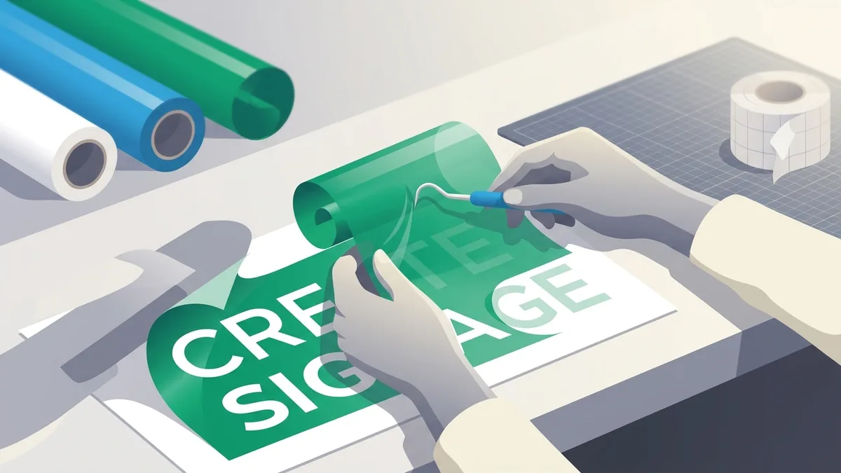
Ask a sign maker which part of a lettering job they would automate first and the answer is rarely the cutting. It is the weeding: lifting the waste vinyl away from every letter, then picking the centers out of every e, a, and o without tearing the parts that stay. How long that takes is decided before the blade ever moves, at the moment you choose the font. This guide covers the type decisions that make sign lettering cut and weed cleanly: which fonts cooperate, how small you can realistically go, why script fonts must be welded, and why text has to become outlines before the file goes anywhere near a plotter.
If your lettering starts as an image rather than typed text, the PNG to vector converter is the conversion step this guide builds on.
What Makes a Font Weed-Friendly
A vinyl cutter does not draw letters. It drags a small swivel blade around each letter's outline, and then a person removes everything that is not the letter. Three properties of a typeface decide how painful that removal is.
Consistent, medium-to-bold stroke weight. When a stroke narrows to a sliver, two problems arrive together. The cut lines on either side of the stroke nearly touch, so the blade's corner behavior starts to matter more than the letterform. And a sliver of vinyl has very little adhesive contact with the liner, so when you pull the weeding matrix, the sliver either tears or comes up with the waste. Fonts with steady stroke width, or a gentle contrast at most, behave predictably at every size. Manufacturers publish real numbers here: according to Stahls', in the cutter guidelines for its CAD-CUT Premium Plus heat transfer vinyl, you should maintain a line thickness of at least 1/16 inch, about 1.6 mm, for lettering and logos. That figure is written for one specific film, not every material in the catalog, but it is a sane default floor for any stroke you expect to cut and weed cleanly.
Open counters. Counters are the enclosed spaces inside letters: the holes in e, a, o, g, B, R. Every counter is a separate piece of waste that has to be picked out by hand, usually with a weeding tool or tweezers. A font whose counters are already small and closed at display size will shrink them to specks at cutting size. Before committing to a font, look at its lowercase e at your target height. If the counter is a pinhole, the job will be slow.
No hairline serifs or tapering details. High-contrast serif designs in the Bodoni and Didot tradition end in serifs and terminals that approach zero width. At cut size those tips are thinner than a dragged blade can turn cleanly, and even when they cut, they peel off with the application tape. The same warning applies to distressed and grunge fonts: every crack and speckle in the texture is a separate cut and a separate piece to weed. A single distressed word can contain hundreds of them.
The categories that consistently behave: geometric and grotesque sans-serifs in medium or bold weights (Montserrat, Oswald, Bebas Neue and their relatives), slab serifs, and rounded display faces. The categories that fight you: ultralight weights of anything, high-contrast serifs, hairline monoline scripts, and textured or distressed faces.
Minimum Letter Heights in Practice
There is no universal legal minimum, but shop practice converges on similar numbers because the physics is the same everywhere. Two limits stack on top of each other: what the blade and vinyl can physically produce, and what a human can weed and apply without losing money on the job.
Common floors, stated as capital-letter height on standard adhesive sign vinyl:
| Lettering style | Practical floor (cap height) | Why this is the floor |
|---|---|---|
| Bold sans-serif | about 1/2 inch | Cuts lower, but weeding time climbs sharply below this |
| Regular-weight sans, slab serif | about 3/4 inch | Counters become tweezer work below this |
| Moderate-contrast serif | about 1 inch | Serif tips are the first thing to tear or lift |
| Connected script (welded) | about 1 inch | Joins and loops close up as size drops |
| Hairline, high-contrast, or distressed fonts | 2 inches, or decline the job | Thin details lift with the weeding matrix |
Many shops simply set a blanket minimum around 1 inch for anything they class as a detailed font, and quote extra time or a redesign below it. That is not caution for its own sake; it is the point where weeding stops being a pass with a pick and becomes letter-by-letter surgery.
Production houses publish the same logic as hard cutoffs. According to StickyLife's production tolerance page, the smallest letter height for vinyl lettering has to be at least a quarter of an inch (0.25") for them to produce it as cut-to-shape at all; anything under that gets printed on clear material with a 1/8-inch contour cut around the design instead. StickyLife states it as a bare production floor without explanation; the reason, from the weeding table rather than their page, is that under a quarter inch the strokes tear off with the matrix and the counters become too small to pick.
Material moves these floors. Glitter, metallic, and thick specialty heat transfer films hold less detail and weed worse, so move every number up. Thin high-grade cast films hold detail better than thick economy calendared vinyl, so you gain a little headroom there.
One more reason not to fight for tiny text: nobody can read it, and the sign industry has actual research on this. The United States Sign Council's "Sign Legibility Rules of Thumb" defines the Legibility Index (LI): the distance in feet at which a sign can be read for every inch of capital letter height. A rule-of-thumb LI of 30 is used as the general average, meaning 1-inch capitals read at about 30 feet and 10-inch capitals at 300, though USSC is careful to call 30 an average that may fall short for a specific sign; its full table runs from 20 to 38 depending on the font (Helvetica reads farther than Clarendon), letter and background color, and how the sign is lit.
The number that matters most for a vinyl shop is the parallel one. For signs mounted flat against a building, parallel to traffic, which is exactly where storefront vinyl lettering lives, USSC drops the index from 30 to 10: letters must be roughly three times taller, because drivers catch parallel signs only in sideways glances measured in fractions of a second. Their worked example: a parallel sign with 500 feet of available reading distance (what USSC calls the maximum available legibility distance, a function of lanes and how far the sign sits from the road) needs 50-inch capitals, versus 17 inches for a perpendicular sign readable down the same 500 feet. Our read is that this parallel figure is where the conservative "1 inch per 10 feet" rule on vendor sizing charts comes from, and it is the safe planning number for building-mounted lettering. Vendor calculators land in the same place: TheSignChef's letter sizing calculator, which credits its numbers to research from the Pennsylvania Transportation Institute at Penn State and the USSC, gives a 3-inch minimum and a 6-inch recommendation for a sign that must read at 60 feet, and caps a 6-inch letter's readable range at about 150 feet for 20/20 vision.
So lettering on a truck door that should read from thirty feet wants to be around three inches tall. If the layout only works with half-inch body text, the layout is wrong for a sign, and no font choice will rescue it.
Script Fonts Must Be Welded
Connected script fonts are the single most common cause of ruined lettering jobs, and the failure is invisible on screen.
Here is the mechanism. In a script font, each glyph is designed so its exit stroke overlaps the entry stroke of the next letter. When the text becomes vector outlines, each letter is still its own closed shape. On a filled preview the overlaps disappear and the word looks like one continuous ribbon. The plotter, however, cuts every path in the file, including the segments buried inside the neighboring letter. The result is joins severed at every connection, thin crescent slivers where the outlines crossed, and a word that falls apart on the transfer tape.
The fix is welding: a boolean union that merges all overlapping outlines into one continuous path. Different software, same operation. Cricut Design Space and Silhouette Studio both call it Weld. Illustrator calls it Unite, in the Pathfinder panel. Inkscape calls it Union, under the Path menu. CorelDRAW calls it Weld as well.
Two habits make welding reliable. First, verify it: switch to wireframe or outline view after welding and confirm no cut lines cross inside the letterforms. If you can still see a line passing through the body of a letter, the plotter will cut it. Second, weld last, on a copy. Welding is destructive, and Silhouette's own education site, Silhouette 101, spells out exactly what that means: welded text loses its text properties, meaning the font name, the font size, and the ability to change what it says, and once welded "it cannot be changed and you'll have to start over." So keep a live-text version of the file for revisions. The same Silhouette 101 page documents a non-destructive escape hatch for Silhouette users: the Cut Edge option in the Send panel, an automatic weld applied at cut time that follows the outside edge of the letters, ignores the overlapped areas, and leaves the text fully editable.
Welding is not only for scripts. Any time you tuck letters together for a tighter lockup, overlap a swash across a descender, or slide a tail under the next word, you have created overlaps that must be united before cutting.
A Full Year of Conversions for $49
Starter Annual: 25 conversions every month, $49 for the whole year. That is about $4.08 a month · Cancel anytime
Get the Annual DealText to Outlines Is Mandatory
Fonts do not travel with files. An SVG, EPS, or PDF that contains live text stores only the font's name and the character codes. Whoever opens that file needs the exact font installed; if it is missing, the software substitutes another one, and the widths, joins, and letterforms all change. Cutting software is worse than design software here: many cutters and RIPs simply cannot render text elements at all. What a plotter needs is paths.
So before a lettering file leaves your computer, convert every piece of text to outlines. In Illustrator that is Type, then Create Outlines. In Inkscape it is Path, then Object to Path. In CorelDRAW it is Convert to Curves. As with welding, keep an editable master, because a typo in outlined text can only be fixed by retyping.
If you need clean lettering without opening a design suite, our text to SVG generator does the outline conversion for you: type the text, pick from 18 commercially licensed fonts across script, serif, sans, and display categories, adjust spacing, and download an SVG built entirely from path data, with no text elements in it. One honest caveat: it exports the raw glyph outlines and does not weld them, so if you choose one of the connected script fonts, run a Weld or Union on the result in your design or cutting software before you cut, exactly as described above.
Letter Spacing and Kerning for Weeding
Tight kerning that looks elegant in print creates weeding traps in vinyl. When two letters sit a blade-width apart, the waste between them is a hairline wall of vinyl that tears instead of pulling away, and the fragments left behind have to be picked out individually.
The rule is binary: letters should either clearly overlap, in which case you weld them into one piece, or clearly stand apart, with a gap wide enough that the waste between them pulls as part of the matrix. Small lettering benefits from added tracking for exactly this reason. Watch the pairs that automatic kerning pulls closest together, such as AV, To, Ta, and Wa; at small sizes they often need to be opened up by hand.
For larger layouts, help the weeder further: keep a margin of waste around the whole design so there is something to grip, and on multi-line work add horizontal weeding lines between rows so the matrix comes off in strips instead of one large, tear-prone sheet.
And when the detail is fragile no matter how you space it, weed against something sticky. Siser North America, writing about its EasyPSV adhesive vinyl, recommends reverse weeding especially when "the design includes heavy color saturation, small fonts, or fine detail": squeegee the transfer tape or mask onto the cut vinyl first, separate the vinyl from its backing, and weed off the sticky tape, because, in their words, "weeding off of something sticky keeps fine detail intact." The letters are held by adhesive across their whole face instead of clinging to a release liner, so the slivers stay put while the waste comes away.
ALL CAPS Versus Mixed Case at Distance
Capitals have real advantages on signs. Every letter is the same height, there are no descenders to complicate line spacing, and for a given line height the letters themselves are physically taller, which buys reading distance. For short, high-impact lines, a business name, OPEN, a unit number, caps are usually the right call.
There is a measured cost, though. According to the same USSC legibility document, its standard index already reflects a 15 percent increase in the letter height required when copy is set in all caps instead of upper-and-lowercase with initial caps. Caps buy you height per line, then hand part of it back in legibility per inch.
Mixed case wins as soon as the text gets longer. Readers recognize words partly by their silhouette, and ascenders and descenders are what give words a silhouette; all-caps text is a rectangle. Taglines, addresses, and anything past a few words read faster in mixed case. And never set a connected script in all caps: script capitals are designed to start words, not to join each other, so an all-caps script neither connects nor reads.
Free SVG Tools for Crafters
Design Checker · Color Separator · Mat Preview · Offset Generator · Text to SVG
Check Your SVG FreeCheck the Font License Before It Becomes a Sign
One last trap that has nothing to do with the blade. Fonts are licensed software, and sign work uses them in exactly the two ways foundries write specific clauses about: signage and logotypes. Every foundry sets its own terms, so treat this as one concrete example rather than an industry rule: Commercial Type's FAQ covers use in logotypes under its standard desktop license, "with the exception of logotypes that will be used on merchandise for sale as a primary visual element." Their own example is a band logo printed big across t-shirts that are sold, which requires an additional merchandise license; the same logo on signage, letterhead, business cards, packaging, or giveaway items like pens and tote bags stays covered by the desktop license used to create it. If the lettering you are cutting will end up as a customer's logo on products they sell, spend ten minutes with the EULA of whatever font you picked before it becomes their brand.
A Pre-Cut Checklist
- Choose a weed-friendly font at or above the size floor for your material, and check it against the viewing distance.
- Fix spacing: open up tight pairs or commit to overlapping and welding them.
- Convert all text to outlines and weld every overlap, keeping an editable master copy.
- Check the file before it reaches the machine. Our free cut file checker runs in your browser, with nothing uploaded, and flags open paths, shapes that look closed but hide a micro-gap, stacked duplicate lines that cut twice, and embedded raster images. It checks path integrity; it does not judge whether your letters are big enough to weed, so that part stays on you.
- If the lettering arrives as a customer's JPEG or PNG logo rather than as text, vectorize it first with the vinyl cut file converter. It traces the pixels it is given, so ask for the largest original the customer has; a tiny web logo will produce soft curves no tool can sharpen. One watermarked preview a day is free with no signup, and the clean file comes with a plan from $7.99 a month for 25 conversions.
- For the broader file-preparation picture beyond lettering, see our guide to SVG for vinyl cutting.
FAQ
What is the best font for vinyl cutting signs?
There is no single best font, but there is a reliable profile: medium-to-bold weight, steady stroke width, open counters, and no hairline serifs or distressed texture. Bold geometric and grotesque sans-serifs and slab serifs are safe defaults. Judge any candidate by its lowercase e at your actual cutting size, and keep strokes at or above the 1/16-inch floor Stahls' publishes for its HTV lettering.
Why is my cutter slicing through the middle of my script lettering?
Because the letters overlap and were never welded. Each glyph is a separate closed outline, and the plotter cuts every line in the file, including the segments hidden inside neighboring letters. Run a Weld (Cricut, Silhouette, CorelDRAW) or Unite/Union (Illustrator, Inkscape) on the lettering, then confirm in wireframe view that no cut lines cross inside the letterforms. Silhouette users can also use the Cut Edge option in the Send panel, which welds at cut time and keeps the text editable.
How small can vinyl lettering realistically be?
On standard sign vinyl, bold sans-serifs stay practical down to around a half inch of cap height, regular-weight fonts to around three quarters of an inch, and scripts and serifs to around one inch, which is why many shops set a one-inch minimum for detailed fonts. Producers publish hard floors too: StickyLife will not produce cut-to-shape vinyl lettering under 0.25 inches tall, switching to print-on-clear with a contour cut instead. Glitter and thick specialty films push all of these floors upward. Below the floor the file may still cut, but weeding time eats the job's margin.
How tall should sign letters be for the viewing distance?
The United States Sign Council's rule-of-thumb Legibility Index is 30, meaning one inch of capital letter height per 30 feet of reading distance for a sign facing traffic, with a documented range of 20 to 38 depending on font, colors, and lighting. For lettering mounted flat on a building, parallel to traffic, USSC drops the index to 10, so plan on roughly one inch per 10 feet. TheSignChef's calculator, built on Penn State Transportation Institute and USSC research, recommends 6-inch letters for comfortable reading at 60 feet, with 3 inches as the bare minimum.
Do I still need to convert text to outlines if I am sending an SVG?
Yes. An SVG can contain live text elements that reference a font by name, and the machine or person opening it needs that font installed, which cutting software often cannot handle at all. Convert text to paths before exporting, or generate the lettering with a tool that outputs pure path data from the start.
A Full Year of Conversions for $49
Starter Annual: 25 conversions every month, $49 for the whole year. That is about $4.08 a month · Cancel anytime
Get the Annual DealSources
- United States Sign Council — "Sign Legibility Rules of Thumb" (2006), Andrew Bertucci — the Legibility Index: the rule-of-thumb LI of 30, the full 20–38 table by font, color, and illumination, the parallel-sign LI of 10 with the 500 ft / 50-inch worked example, and the 15 percent all-caps height increase.
- TheSignChef — Letter Sizing Calculator — 3-inch minimum and 6-inch recommended letter height at 60 feet, the ~150 ft readable range for a 6-inch letter, and its attribution to Penn State PTI and USSC research.
- Stahls' — CAD-CUT Premium Plus Heat Transfer Vinyl, Cutter Guidelines — the 1/16-inch minimum line thickness for lettering and logos.
- StickyLife — Tolerance for Cut Margins, Bleeds and Minimum Cut Sizes — the 0.25-inch minimum letter height for cut-to-shape vinyl lettering and the print-on-clear fallback with a 1/8-inch contour cut.
- Silhouette 101 (Silhouette America) — Creating Text in Silhouette Studio — Weld's destructive loss of text properties and irreversibility, and the non-destructive Cut Edge option in the Send panel.
- Siser North America — Reverse Weeding: What, When, and Why? — reverse weeding recommended for small fonts and fine detail; weeding against a sticky surface keeps detail intact.
- Commercial Type — FAQs — desktop-license coverage of signage and logotypes, and the merchandise-license carve-out when a logo is the primary visual element on merchandise for sale.